What is the Pareto analysis?
Many engineers working in manufacturing turn to conducting a Pareto Analysis when they want to take the data in front of them and arrange it in a way that clarifies:
- How frequent the causes of problems are
- Which problems or causes are most significant
The Pareto Analysis is related to the Pareto principle or 80/20 rule which states that for many outcomes, roughly 80% of consequences come from 20% of causes (the “vital few”). (Wiki)
As you can imagine, engineers working on developing and manufacturing a new product find it very useful indeed for improving product quality*, as it allows them to find the ‘vital few’ causes of defects, for example, in the new product’s design; precisely why we use this tool ourselves at Agilian!
*It isn’t limited to quality, though, and can be used for many types of data analysis in almost any field or industry, such as product sales (20% which sell best), customer complaints (most common 20%), staff performance (which 20% of individuals or teams do best), etc.
How to fill out a Pareto analysis chart?
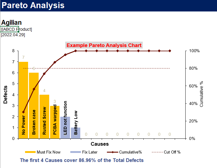
Here’s an example chart for a fictional electronic product similar to those we manufacture for many of our clients:

It isn’t an ordinary bar chart created in Excel that has just been sorted with the highest number of issues on the left. The Pareto chart has a specific specification and format where on the right side there is a cumulative number and on the left side, the number of defects.
Let’s say you are testing an electronic product and as you’re testing you’re finding defects. Each defect or failure mode will be given a standard name so the graph isn’t populated with numerous defects with different names that are actually the same.
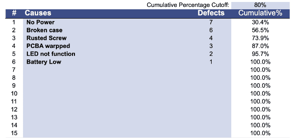
In the analysis spreadsheet there is an input template, shown here:

The failure modes, seen on the ’causes’ axis, are added and in Excel, it’s easy to select the causes and defect columns and then sort from the highest number of defects to the lowest. Once you sort by defects the template automatically sets up the analysis chart using the hidden formula that charts the cumulative per cent and shows you the 80% line intersecting the cumulative per cent.
In the above example the numbers of defects on the left side are clear. ‘No power’ to the product occurred seven times, there was a ‘broken case’ six times, and so on.
On the right side, it’s showing cumulative values between zero and 100 per cent in terms of cumulative total defects and the way we try to use this chart for our benefit is that instead of 100 we take the eighty per cent and draw a line across. Wherever it intersects the next point on the cumulative graph is our threshold used as our guideline for the most critical defective components that MUST be fixed as soon as possible.
In the above chart, you can see how a vertical line from the 80% line points all the way down to four of the defects (those highlighted in yellow). So these are the failures or defects that must be fixed because of the Pareto principle which says that these 20% of the issues found are actually causing 80% of the problems.
By the way, I used a free template to create the example chart here that you can download yourself, It’s a solid template that allows you to customize the labels so you’re able to analyze almost anything…give it a go!
What to fix when conducting a Pareto analysis for product defects?
As mentioned before, the engineers will find it incredibly useful to see, at a glance, the 20% of defects that are responsible for 80% of the problems. During the DVT phases of the NPI process, they will be running tests on product prototypes in order to validate the designs and any defects found can be analyzed with a Pareto analysis. Ultimately this analysis provides an initial grounding that engineers can then base their further actions on. They’ll also consider customer requirements, safety, and maybe a governmental and regulation point of view when deciding what is the most important defect to devote time and money to fix.
Remember, serious defects will increase your product return rate, and there are many reasons why you don’t want to deal with that damaging situation!
The other defects can be classified as ‘non-critical’ (only responsible for 20% of the problems) and aren’t as urgent and engineers can look at fixing these if it’s cost-effective to do so, or they can leave them until the next prototype build and see if they keep coming up and are risks worth pursuing fixes for.
For example, if this was the first build of your new product prototype focus on fixing the critical issues first (those in yellow). The others (in blue) would be considered non-critical at this time, however, if there was one battery failure, that’s a serious problem that would also need to be fixed for safety’s sake even if it is not a common defect.
If you consider that products like an automobile may have thousands of parts, conducting a Pareto analysis, in that case, makes a lot of sense as there are likely to be a lot of failure modes during prototyping. So how else can engineers plough through a mass of data to make fast decisions about which to work on fixing first? The alternative is to count them up manually and make a decision…work that could take a lot of precious time.
Conclusion
Conducting a Pareto analysis is a really important activity for manufacturing quality, reliability testing, and product design engineers.
It provides very quick answers as to which quality issues, for instance, are most deserving of the engineers’ time for fixing which is really important during new product development where the company who invented the product want to keep their budget under control and move along through the process as quickly as possible. Getting bogged down trying to immediately fix every issue that crops up is counter-intuitive and will cost more time and money than is necessary.
Further reading: You might also like this post from QualityInspection.org: Supplier Quality Management: KPIs and Improvement Tools


